| Mike joined | |
|---|---|
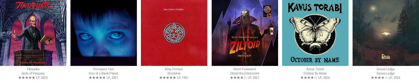
I've been looking for a way to bring back this functionality for the PA forum, so here it is: https://srv.progfreak.com/api/sig/Mike/6/recently-played-covers.png Feel free to try out the url. Just use your own username instead of Mike, and you can change the number of releases displayed to between one and eight. Let me know what you think about it! BTW: It is on the progfreak.com domain for technical reasons, and that might change in the future, but for the next couple of months it won't change. | |
| Rivertree joined | |
great, however some odd style tags occur, f.e 'Prog-Related Canterbury' I've not assigned in that way I'm quite sure https://srv.progfreak.com/api/sig/Rivertree/8/recently-played-covers.png | |
| Mike joined | |
^ Yes, I fixed that bug - it occurred specifically with genres that imply progressiveness. It now just says "Canterbury Scene". My goal here is to build a really short tags badge, will probably also just shorten to "Prog" and "Avant" to save space. | |
| Rivertree joined | |
it would be nice if we rudimentarily could control the size of the rendered image | |
| Mike joined | |
Yes, I can make the size of the covers configurable. | |
| Rivertree joined | |
I was thinking about the possibility of reducing the size of the delivered image. But it's okay the way it is ... | |
| Mike joined | |
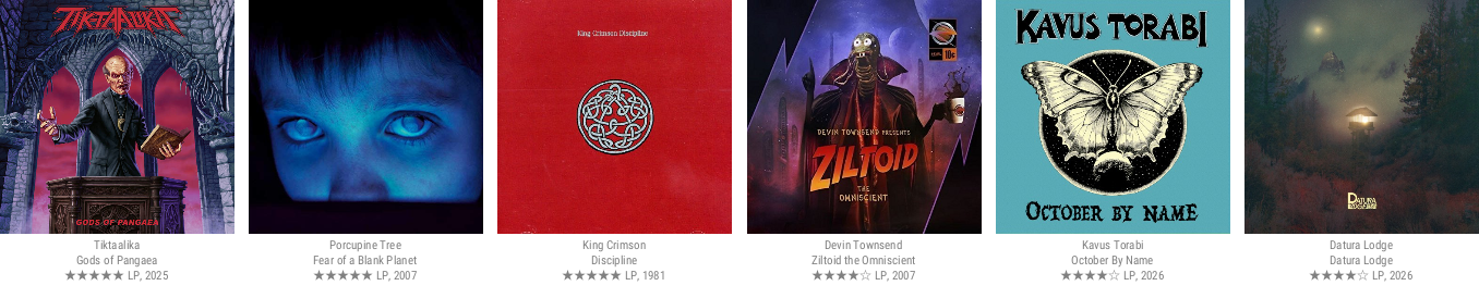
You can now adjust the size of the cover art like this: https://srv.progfreak.com/api/sig/Mike/6-200/recently-played-covers.png This would render the last six releases you listened to with 200x200 sized covers.
Are you referring to the file size? It's difficult to reduce it further. The only way would be to generate a jpg instead of a png, but then the background color could no longer be transparent, and the quality would suffer, making text in the cover art hard to read. | |
| Rivertree joined | |
I meant the image dimensions (width ...), anyway, this looks rather perfect now, Mike! | |
| Mike joined | |
The png version turns out to be excessively big. As an alternative, you can now generate jpg as well. also webp, but that still has limited support in browsers. The only drawback of jpg is that transparency is not supported, so the image gets generated with the PA forum background color. Let me know if you need different background colors ... https://srv.progfreak.com/api/sig/Mike/6-115/recently-played-covers.jpg Also a tip: The PA forum signature limits images to 175px in height. A good maximum image size to specify is 115 (like in the link above), this produces a signature image that's about 170px high. | |
| Rivertree joined | |
top! updated to JPG ... just an idea, how about to present the current signature somewhere on TYM, maybe on the user timeline tab?, if this doesn't need too many resources ... | |
| Mike joined | |
Yes, I will do something like that. At TYM we don't need to use an image, I'll make a template that looks similar. It will also be used here - currently I use the chart template, and that looks way too complicated: | |
| anonymous user | |
I'm still not really understanding how the profile image works in the forum. Mine is still Meanders from Anachronism, which isn't even in my last six anymore. | |
| Mike joined | |
^ It’s both “recent” and “liked” - it shows a recently played release that you rated more than 75/100. I wanted to avoid people ending up with an avatar showing an album they might not even like ;-). Of course this should be documented until it is made configurable, probably with a clickable info icon. | |
| anonymous user | |
So 76 or higher? I have rated a ton of albums at 75, since 75 is in between my personal B+ and B- tiers, so if I'm unsure, that's what I go with and there's a lot of them lol For me, it is very hard to get a rating higher than a 75, as it tends to be a cutoff for a lot of my criteria (being in between the B- and B+ tiers). I'd like to see ratings at a 75 appear here, as well, if you can change that. That's an even 3/4 rating, so it makes sense, in that regard. Edit: Yup I just changed my rating on Folium Limina from 7.5 to 7.6, and the image changed here lol | |
| Mike joined | |
Ok, I bow to the standard ways of doing math ... we now round up for .5 ratings. So 7.5 will be displayed as an 8, or 4 stars in a five-star system, and will be good enough for avatars as well. | |
| anonymous user | |
Is the cutoff now 7.0? That appears to be the case. I liked it better at 7.5 because there's a lot that I tag under 7.5 but above 7.0 that I wouldn't consider good enough to be represented in my image here. 7.5 is when I think something is truly noteworthy and great. | |
| Mike joined | |
I‘d like to change it to 8.0 (only awesome or better) … | |
| anonymous user | |
better than 7.0, but my image would rarely ever change at that point lol | |
| anonymous user | |
yeah Mike, make the profile picture an 8.0 or higher, please. My image is changing too frequently lol | |
| Rivertree joined | |
looks like the signature process is not running anymore, or something like that ... |